

Your website is often a visitor’s first and lasting impression of your church. With the right church website features, you can move someone from casual browser to engaged guest. This blog walks you through which features matter most—from mobile responsiveness to online connection forms—and how to improve your church website guest experience without starting from scratch.
Your Website Is a First Impression That Lasts
Most church guests will visit your website before ever stepping through your doors. And whether they return often—or not at all—depends on what they experience online.
For many churches, their site is outdated, confusing, or slow to load. It might work fine on a desktop but break down on mobile. Or it lacks clear calls to action that guide new visitors forward.
That’s a problem. Because in today’s digital-first world, a weak online presence can unintentionally send the wrong message about your church’s mission and heart.
In this blog, we’ll show you how to audit your church website and identify what features are essential to keep guests coming back. You’ll learn how to align your content, structure, and tools so your website doesn’t just inform—but invites and includes.
These tips will help you plan your website, boost engagement, and create a site that reflects who you are as a church family.
1. Mobile-Friendly Design for Every Guest
The majority of your visitors will land on your church website from their mobile devices. Whether they’re riding the bus, standing in the grocery store line, or sitting on their couch, their phone is the primary window into your ministry. If your website design doesn’t adapt to their screen, the experience breaks—and so does their first impression.
Think beyond just shrinking down the desktop view. Mobile-friendly design means clear navigation, legible fonts, fast-loading pages, and tappable buttons. When a guest can’t click the service time, can’t find directions, or has to pinch-and-zoom just to read your welcome message—they leave.
ChurchSpring takes the guesswork out of this process. Every church website is fully responsive, ensuring a seamless mobile experience from day one. You don’t need to code or configure anything. Just launch and go.
If your site isn’t mobile-optimized, you’re turning away guests before they even visit.
“Love this website. So easy to use. Since using ChurchSpring, our website has had many more visits. Highly recommend it!”
Tammy D., Country Cowboy Church
2. Clear, Simple Navigation That Guides Visitors
Great design is about more than colors and fonts—it’s about clarity. A guest should never feel lost on your website.
Structure your menus around the questions new visitors are asking:
- What time is service?
- Where is your church located?
- What do you believe?
- How can I connect?
Highlight your primary pages in your top navigation bar: “Plan Your Visit,” “Watch Sermons,” “Contact Us,” and “Give.” Limit dropdown items and keep naming consistent.
Your navigation should work like a warm greeter—not a maze.
3. Fast Load Times for Better First Impressions
Speed matters. If your church website takes more than 3 seconds to load, you risk losing visitors before they ever read a word.
Use compressed images, clean code, and a lightweight platform to speed up your site. Avoid large videos that autoplay and optimize your homepage for quick access.
Most church website platforms today offer built-in optimization to ensure your site loads quickly, even for visitors with slower internet connections. Prioritizing speed isn’t just about performance—it’s about keeping potential guests engaged from the moment they arrive.
Don’t let a slow site cause guests to give up before you’ve even said hello.
4. Sermon Archive That’s Easy to Watch or Read
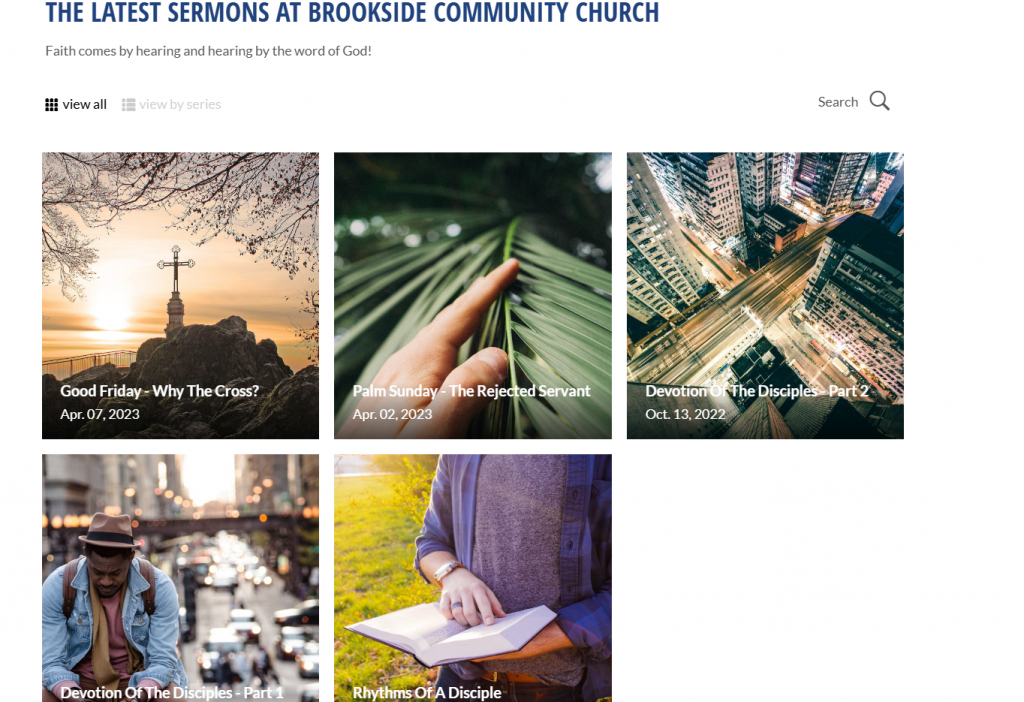
Your sermon library is one of the most visited areas of your site. Make sure it’s organized, up-to-date, and easy to search.
Whether someone missed a Sunday or is exploring your church for the first time, sermons help them understand your teaching and values.
Include titles, series graphics, dates, and links to video or audio. Bonus: add a short description or Scripture reference.
Many church website platforms now provide built-in sermon tools that allow you to upload weekly messages with just a few clicks—saving time and keeping your media library fresh.
Guests want to know what you preach—make it easy to find out.
5. Connection Forms and Online Prayer Requests
Want your church to feel personal—even online? Then your website needs more than announcements and service times. It needs connection points that invite real interaction. Forms like “Plan a Visit,” “Ask for Prayer,” “Contact a Pastor,” or “Get Involved” allow guests to raise their hand, express a need, or take a next step.
These forms signal to visitors: “We see you. We care. And we want to hear from you.” That one moment of interaction could be the open door someone needs to begin their faith journey—or come back to church after years away.
Connection forms also serve your ministry team by organizing communication. You can route inquiries directly to the right leader or volunteer team, streamlining follow-up and saving time.
Consider adding:
- A brief welcome form for first-time visitors
- A private prayer request form with optional confidentiality
- A volunteer interest form with specific roles listed
- A sign-up form for Bible studies or seasonal events
Using built-in form builders available in most website platforms, you can easily create these touchpoints without needing coding skills. Keep your forms short, secure, and simple—focus on clarity over complexity.
Interaction builds relationship. Don’t let your site be all info—make it personal.
6. Blog or Encouraging Content That Reflects Your Voice
Guests want to know what kind of church you are—not just from what you say on Sunday, but how you communicate throughout the week. A blog or devotional section on your website offers them a window into your church’s voice, heart, and everyday ministry.
It’s your chance to go beyond service times and event listings. Through regular content, you can share pastor reflections, highlight volunteer stories, offer weekly devotionals, or recap recent events in your community. These small touches build relational trust and help guests feel like they already know your church before they ever walk through the door.
Blogs also support your mission in practical ways:
- They help your church stay visible in search engines through fresh content
- They give members and newcomers a reason to revisit your website
- They allow leaders to reinforce Sunday messages or clarify next steps
- They showcase your church’s involvement in local outreach and ministry life
Many website platforms offer user role features, allowing pastors, staff, and volunteers to contribute content without risking errors or overlaps. You don’t have to write a full article every week—just keep the rhythm going with simple, heartfelt content that serves your people.
Content builds trust. Speak directly to visitors through your words—and let your website echo your church’s voice all week long.
7. Visual Branding That Reflects Who You Are
Your website should visually reflect the life and personality of your church—not a cookie-cutter template or outdated design. When guests land on your homepage, the branding should match the heart of your ministry. That means colors, fonts, and imagery should feel warm, consistent, and uniquely yours.
Branding isn’t just about aesthetics—it’s about clarity and trust. Inconsistent design elements (like mismatched fonts or low-quality images) can unintentionally communicate disorganization. But when your visuals are cohesive, people sense that your church is thoughtful and welcoming.
To strengthen your site branding:
- Use real photos of your congregation in action: worship, fellowship, serving
- Stick to 2–3 core colors that align with your physical signage and bulletins
- Choose one headline font and one body font for readability and flow
- Avoid clip art or overly generic stock images
Modern website platforms make it easy to update these design settings site-wide through a visual editor or style panel. That means you don’t need to be a graphic designer to create a visually compelling, branded experience.
Consistent church website branding builds credibility and emotional connection.
8. Easy-to-Find Giving Page
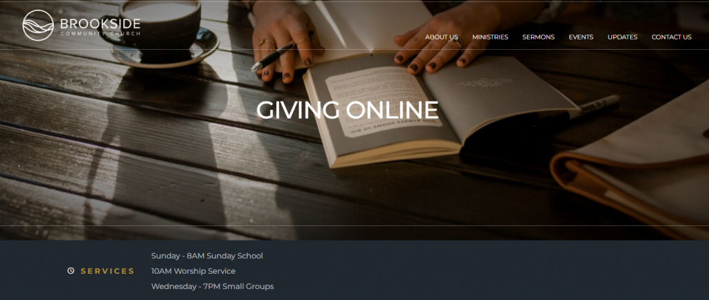
If someone wants to give, don’t make them search. Your giving page should be one of the most visible and accessible parts of your church website—because generosity shouldn’t be hard.
Avoid hiding the giving link in a submenu or footer. Instead, include a “Give” button in your top navigation bar, homepage, and even your mobile menu. Use a short sentence to explain how donations support the mission of your church—whether it’s local outreach, global missions, youth programs, or general ministry operations.
A clear, secure, and easy-to-use giving experience encourages more people to participate—especially first-time guests or online attenders. Remove unnecessary clicks and confusion. The process should take less than a minute from start to finish.
Most church website platforms now include native giving tools or seamless integration with secure third-party providers. Choose a system that allows recurring donations, mobile access, and fund designations.
Giving is part of worship. Make it simple, visible, and secure—so that generosity becomes a natural next step.
9. Built-In Tools to Help You Run Website Health Checks
Once your website is up, it still needs regular attention. Set time monthly or quarterly to run website health checks:
- Are all links working?
- Is sermon content current?
- Are announcements and banners up to date?
- Does everything work on mobile?
ChurchSpring’s church website builder makes these checks quick and easy. Anyone on your team can spot issues, update content, and ensure a fresh experience for every guest.
A healthy website reflects a healthy ministry. Don’t let yours grow stale.
Build a Guest-Ready Website That Reflects Your Mission
If you want to improve your church website’s guest experience, don’t just settle for a pretty homepage or flashy graphics. A truly guest-friendly website combines strong content, strategic structure, and clear connection points. Visitors don’t just need to be impressed—they need to be guided, welcomed, and invited back.
Each of the features we explored—mobile design, fast load speeds, clear navigation, updated sermons, connection forms, blogs, and consistent branding—works together to create a unified digital experience. When done right, your website becomes a digital front door that reflects your church’s mission and builds trust from the first click.
Whether someone is exploring faith for the first time, looking for a new church home, or returning after years away, your website may be their first glimpse of your community. Make sure it reflects who you are and how you serve.
Now is the time to rethink your church website strategy and create a space that inspires connection and long-term engagement.
Focus on the features that matter:
- Mobile-friendly design
- Clear, helpful navigation
- Fast load times
- Accessible sermon archives
- Personal connection forms
- Encouraging, updated content
- Strong, consistent branding
- Simple giving experience
And most importantly, pick tools like ChurchSpring that make it easy to stay updated and welcoming.
With ChurchSpring’s Church Website Builder, you get:
- Beautiful, mobile-optimized templates
- Built-in forms, blogs, and giving features
- Drag-and-drop editing (no coding required)
- Real-time updates and fast publishing
“ChurchSpring not only gives our church website a professional look but it’s so easy to use… I can update anything in just a few minutes.”
Lynn Passet, Community Bible Church
Try ChurchSpring free for 7 days or join a live demo to see how you can turn your church website into a place that welcomes, informs, and inspires.