The web is constantly changing, and it can be difficult to keep up, difficult to discern the trends from the “musts” that will keep your church’s website from facing harsh penalties.
Rejoice — we’re here to help, starting with the latest in Google’s latest “mobile-friendly” formula update.
What does mobile-friendly mean?
“Mobile-friendly” means that a website looks great and performs beautifully on a mobile device, such as a smartphone, tablet, and everything in between.
When a website isn’t mobile-friendly, it can be frustrating for people to use. The text is small and hard to read, links are difficult to click, and loading time can be painfully slow.
And with so many other church websites out there, it’s easy for people to abandon yours in favor of one that’s less frustrating.
Why does my church website need to be mobile-friendly?
More than 60% of people worldwide are now using mobile devices instead of laptops or desktop computers to access the internet. And statistics predict that within just two years, more than 90% of internet users will be using mobile devices!
So it’s incredibly important that you don’t ignore the majority of internet users, especially if you’re looking to spread the good news of Jesus Christ in the digital world, or to grow your congregation.
Because people aren’t looking for churches in the Yellow Pages anymore — they’re looking online. They’re Googling “Baptist church Dallas” or “Lutheran churches in Cleveland”. And they’re performing those searches on mobile devices more than ever before.
As of April 21, 2015, when your church comes up in the search results on a mobile device, Google will either reward or punish your website based on how mobile-friendly it is.
Mobile-friendly websites will get pushed to the top of the search results on Google, while sites that haven’t changed with the times will get buried beneath more mobile-friendly options. So it will be easier for mobile internet users to find mobile-friendly church websites than non-mobile-friendly ones.
Why is Google doing this?
Google has made a commitment to improving the internet for mobile users. Sure, Google’s reasons for doing this aren’t entirely selfless (more happy Google users means more revenue for Google, at the end of the day), but this change will result in a better internet experience for everyone.
How is a responsive website different from a mobile website?
You may have heard of mobile websites. A mobile website is separate from the desktop computer version of a website, often slimmed down and optimized for users “on the go”.
Mobile websites will often have a letter “m” (for “mobile”) in the website address (e.g., m.mychurch.com) so that search engines know to direct mobile traffic to these websites instead of the main desktop website. Usually, a church will have a mobile website in addition to its traditional desktop website.
A responsive website, on the other hand, is a specially coded website that automatically adjusts itself to fit whatever device is being used to access it, whether that’s a large desktop computer or a smartphone.
Both mobile websites and responsive websites are seen as “mobile-friendly” by search engines like Google.
Some churches choose to have a single responsive website instead of both a traditional and mobile website.
This is because it’s difficult to keep content fresh and up-to-date on two websites, so churches are increasingly opting for a single responsive website to lessen the burden on their staff. It can also be more costly to create and maintain two websites instead of just one.
How do I know if my current website is mobile-friendly?
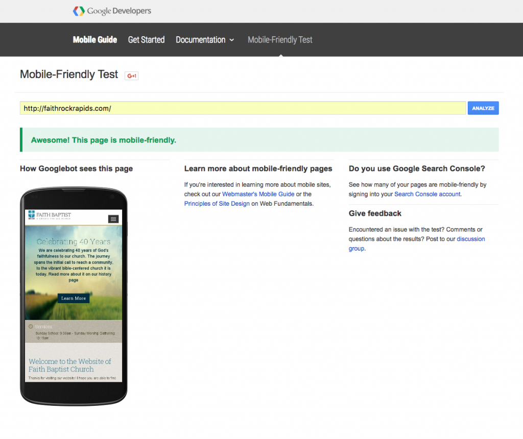
Google has created a handy mobile-friendliness tool that will give you a clear “yes” or “no” answer (there’s no middle ground).
Simply type in your church’s website address (such as mychurch.com) and click “Analyze”. It will tell you whether that page is mobile-friendly or not, and even show your picture of what that web page looks like on a mobile device.
Please note that the tool tests on a page-by-page basis, so if you want to test additional pages on your church website (such as an “Our Staff” or “Events Calendar” page), you’ll have to run the test for each of those as well. But you can get a pretty good idea of how mobile-friendly your church website is by just testing the homepage and one or two other pages.
What do I need to do?
Check and see if your website is mobile-friendly using the tool above. If it’s not, let us know if you’d like us to help with the transition. Explore the benefits of ChurchSpring’s free mobile app. Sign up for a free trial of ChurchSpring and get access to our free church mobile app. Or join us in a free demo to see how you can revolutionize your church’s app.


