With church websites becoming increasingly critical for connecting with congregants and reaching prospective members, it’s important to analyze examples of effective church sites. Creating a website that not only attracts but also engages and retains visitors is essential. But simply having a website isn’t enough; it needs to attract, engage, and retain visitors.
Achieving this can feel daunting, especially without the right design principles and tools. A truly successful church website should feel like an online extension of your church’s mission—reflecting its warmth, inclusivity, and community spirit while providing a seamless user experience that encourages deeper connections.
Elements such as intuitive navigation, compelling content, and a mobile-friendly design are crucial in achieving these goals:
-
Focus on UX: User experience should be at the forefront of your design decisions. Easy navigation, clear menus, and intuitive layouts are essential for guiding visitors through your site.
-
Incorporate Compelling Content: Use a mix of text, images, and videos to tell your church’s story. Engaging content is crucial for building a connection with your audience.
-
Mobile Optimization is Key: Ensure that your website is fully optimized for mobile devices. With the majority of users accessing websites on their phones, a mobile-friendly site is non-negotiable.
Let’s dive deeper into these best practices to apply on your church website so you can apply them today.
1. User-Friendly Navigation
When visitors land on your church website, they need to quickly and easily find what they are looking for. ChurchSpring’s Acts Website Design Template showcases this with clear, straightforward menu options like “Home,” “About Us,” “Ministries,” and “Events.” The layout is intuitive, ensuring that information is accessible without overwhelming the user.
User-friendly navigation is critical for establishing trust and credibility. With 75% of users judging a website’s credibility based on its design, having a well-organized menu is non-negotiable. Your church website builder should allow you to create and update menus with just a few clicks, ensuring that your navigation is always intuitive and user-friendly.
“ChurchSpring has been one of those rare products that performs as advertised. One of the top reasons we chose ChurchSpring was for ease of editing and updating the website. As promised, it has been just that…easy. The picture library is also helpful as are the little tips that get emailed to us regularly about other tools and sites we can use and incorporate. I would recommend ChurchSpring to anyone who is seeking to simply start a website or find a partner to breath life back into the one you have,” 2. Vibrant Colors and Fonts
Karl M. from Timberville Church of the Brethren
The combination of colors and fonts enhances the user experience by making the site visually appealing and easy to read. The importance of church design lies in creating a space where visitors feel welcomed and engaged from the first click.
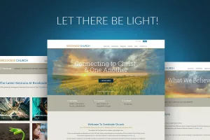
ChurchSpring’s Light Website Design Template excels in using vibrant colors and readable fonts that reflect a warm and welcoming atmosphere. Make sure that your website colors align with your church’s values.
2. Vibrant Colors and Fonts
The combination of colors and fonts enhances the user experience by making the site visually appealing and easy to read. The importance of church design lies in creating a space where visitors feel welcomed and engaged from the first click.
ChurchSpring’s Light Website Design Template excels in using vibrant colors and readable fonts that reflect a warm and welcoming atmosphere. Make sure that your website colors align with your church’s values.
3. Incorporating Multimedia Content
Multimedia content is a powerful tool for enhancing the overall user experience and improving search engine rankings. Add images, video, and graphics to your church website to reflect your church community and make your website more visually appealing.
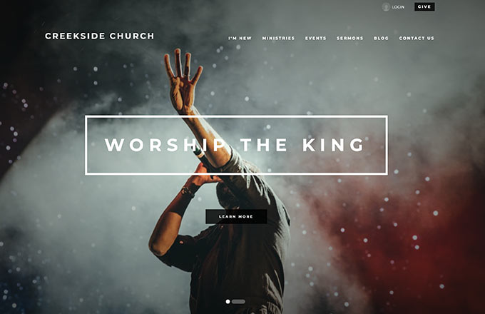
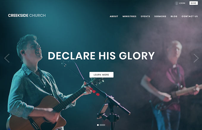
ChurchSpring’s Ezra Website Design Template incorporates multimedia elements, including photos, videos, and slideshows, to tell the church’s story. ChurchSpring offers 1,000+ free high-quality images through our Media Library, making it easy to find and integrate the perfect visuals into your site.
4. Mobile Optimization
Mobile optimization is crucial for improving user experience and boosting search engine rankings. Make sure that your website is accessible and easy to navigate on mobile devices, such as a phone or tablet, to significantly increase visitor engagement and satisfaction.
For example, if a popup covers the entire website preventing a visitor from clicking the menu, they are having a poor experience on your website. Yet, if pictures fit within their mobile screen and text size is automatically adjusted for their screen size, your website visitor will be able to easily interact with your website.
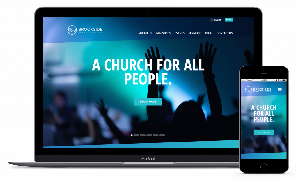
In today’s mobile-first world, ChurchSpring’s Titus Website Design Template is a prime example of excellent mobile optimization. Like all of ChruchSpring’s website designs, the website is designed to automatically function seamlessly across all devices, ensuring that visitors have a consistent experience whether they’re on a desktop, tablet, or smartphone.
ChurchSpring’s free Mobile Church App syncs directly with your website, ensuring that your congregation always has access to the latest sermons, events, and online giving options. No need to make updates in multiple locations—the church app automatically updates with your website changes.
5. Visually Compelling Stories
Storytelling is a key component in creating a strong connection with visitors. By visually sharing stories of members and community involvement on your church website, you can foster a sense of belonging and encourage deeper engagement.
ChurchSpring’s Revelation Church Website Design Template visually shares stories of transformation, redemption, and hope. You can highlight testimonies of individuals whose lives have been changed by God or community involvement with a blog, images, or video that fosters connection and encourages visitors to engage further with your church.
Additional Tips to Enhance Your Church Website
Use Relevant and Updated Images
Incorporating seasonal, event-related, and member-focused images on your church website is a great way to foster a connection with both visitors and your church family. Regularly updating and optimizing website images to reflect current events or seasons keeps your website fresh and engaging. This approach not only enhances visual appeal but also showcases the vibrant life of your church community, making your site more inviting and relatable.
Keep Content Fresh and Relevant
One of the best practices for maintaining an engaging church website is to regularly update your content. This includes sharing:
-
Upcoming events
-
Sermon series
-
Community outreach initiatives
Fresh content not only keeps visitors returning to your site but also signals to search engines that your website is active and valuable. Additionally, consider sharing insights from a pastor’s perspective to provide unique and engaging content that resonates with your audience. By focusing on these elements, your church website will remain a dynamic and inviting space that effectively serves your congregation and attracts new visitors.
“I give ChurchSpring a 10 out of 10 in the design and functionality of their website simply because it is Turnkey. It is the simplest, most professional looking, functional website I have ever seen by far,”
Kevin S. from Gold Coast Church of Christ
Key Takeaways for Designing Your Church Website
Creating an effective church website goes beyond just aesthetics; it requires a thoughtful blend of design, user-friendly navigation, and compelling content that resonates with visitors. A well-designed website should reflect your church’s mission and values while creating a welcoming online presence. Ensuring that your site is mobile-friendly, visually appealing, and regularly updated with fresh, authentic content is crucial for engaging and retaining visitors. By studying successful church website examples, you can develop a site that not only attracts but also fosters long-term engagement.
Understanding how can use your church website to connect with guests and learning how to promote your church website effectively are key to maximizing your online impact. Integrating analytics tools like Google Analytics can provide valuable insights into visitor behavior, helping you to continuously improve your site.
Ready to take your church website to the next level? Sign up for a free ChurchSpring trial or join us in a free ChurchSpring demo to explore how you can make your online presence as vibrant and welcoming as your physical congregation.


