Church Website Design Ideas to Bring Your Message to Life
As a church leader or volunteer, you want to ensure your online presence reflects the warmth and inclusivity of your congregation. In today’s digital age, a well-designed church website is crucial for reaching both existing members and potential newcomers. Let’s dive into some practical design tips to make your church website not just functional, but truly engaging.
1. Prioritize User-Friendly Navigation
When visitors land on your church website, they should find it easy to navigate and locate the information they need. Incorporate clear menu options like “Home,” “About Us,” “Ministries,” and “Events.” According to research by Stanford University, 75% of users admit to making judgments about a company’s credibility based on their website design. Make sure your website earns their trust from the start with intuitive navigation.
2. Choose Vibrant Colors and Fonts
Color psychology plays a significant role in influencing emotions and perceptions. Opt for colors that reflect your church’s values and evoke a sense of warmth and welcome. Consider using hues like calming blues or inviting greens. Additionally, select fonts that are easy to read and complement your church’s personality. According to a study by Adobe, “89% of users would switch devices or stop viewing altogether when coming across content issues.”
Choose a church website provider that allows for easy color and font changes. ChurchSpring’s Design Center available in every church website builder is a good option because it offers unlimited design choices and simple updates for colors and fonts.
“I give ChurchSpring a 10 out of 10 in the design and functionality of their website simply because it is Turnkey. It is the simplest, most professional-looking, functional website I have ever seen by far.” – Kevin S. Gold Coast Church of Christ
3. Incorporate Multimedia Content
Make your church website visually appealing by incorporating multimedia elements such as photos, videos, and slideshows. Share images of your congregation participating in events, baptisms, or community service projects. Video testimonials from members can also add a personal touch and help visitors connect with your community. Websites with video content may increase your chances of appearing higher in search engine results.
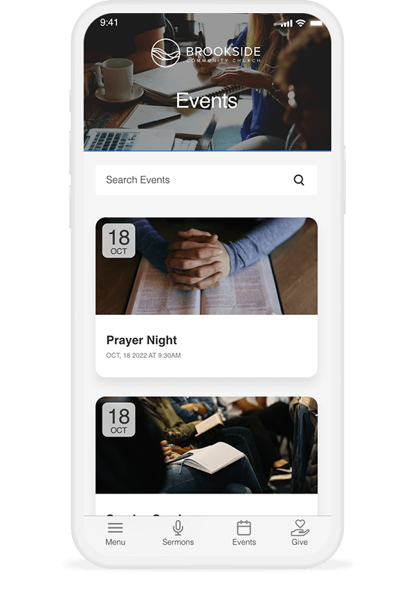
4. Optimize for Mobile
In today’s mobile-driven world, it’s essential to ensure your website looks great and functions seamlessly on all devices. A responsive design not only improves user experience but also boosts your site’s search engine ranking.
Google prioritizes mobile-friendly websites in its search results, making it easier for potential visitors to find your church online, so don’t skip on this tip!
5. Tell Visually Compelling Stories
Stories have the power to captivate and inspire. Use your church website as a platform to visually share stories of transformation, redemption, and hope within your congregation. Highlight testimonies of individuals whose lives have been changed by God or community involvement with a blog, images, or video. Authentic storytelling fosters connection and encourages visitors to engage further with your church.
6. Add Relevant Images
Using seasonal, event, and member images on your church website helps connect with visitors and your church family. Images showing church gatherings, members participating in activities, and volunteer events help bring the church to life online. Displaying photos of real people fosters a sense of community and belonging.
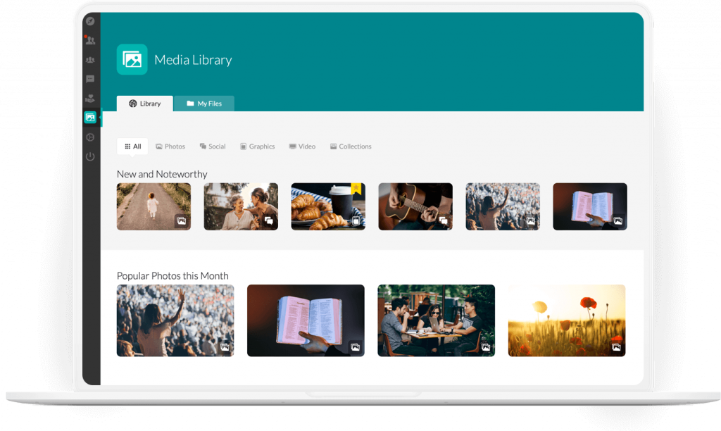
Swapping out images to match holidays and seasons also allows the site to stay fresh and engaging. Visually representing what your church looks like during Advent, Lent, and other important times of year invites newcomers to take part. Custom images that authentically reflect your congregation are vital for crafting a warm, welcoming website. Check out ChuchSpring’s Media Library for fresh and modern images always available at no added cost.
7. Regularly Update Content
Keep your church website fresh and relevant by regularly updating content and information. Share upcoming events, sermon series topics, and community outreach initiatives. Fresh content not only keeps visitors coming back for more but also signals to search engines that your site is active and valuable.
“The ChurchSpring website is user-friendly and the support, when needed, is great.” – John F., Eastside Church of Christ
Create an Engaging Church Website for Your Congregation
A good church website is not just an online brochure. It helps build community, share stories, and spread messages of hope and love to reach more people. Use these design tips to create a great online experience that represents your congregation’s values and beliefs.
Ready to take your church website to the next level? Sign up today for a free demo of ChurchSpring’s all-in-one church growth platform or sign up for a free 7-day trial. Let’s make your online presence as vibrant and welcoming as your physical congregation.


